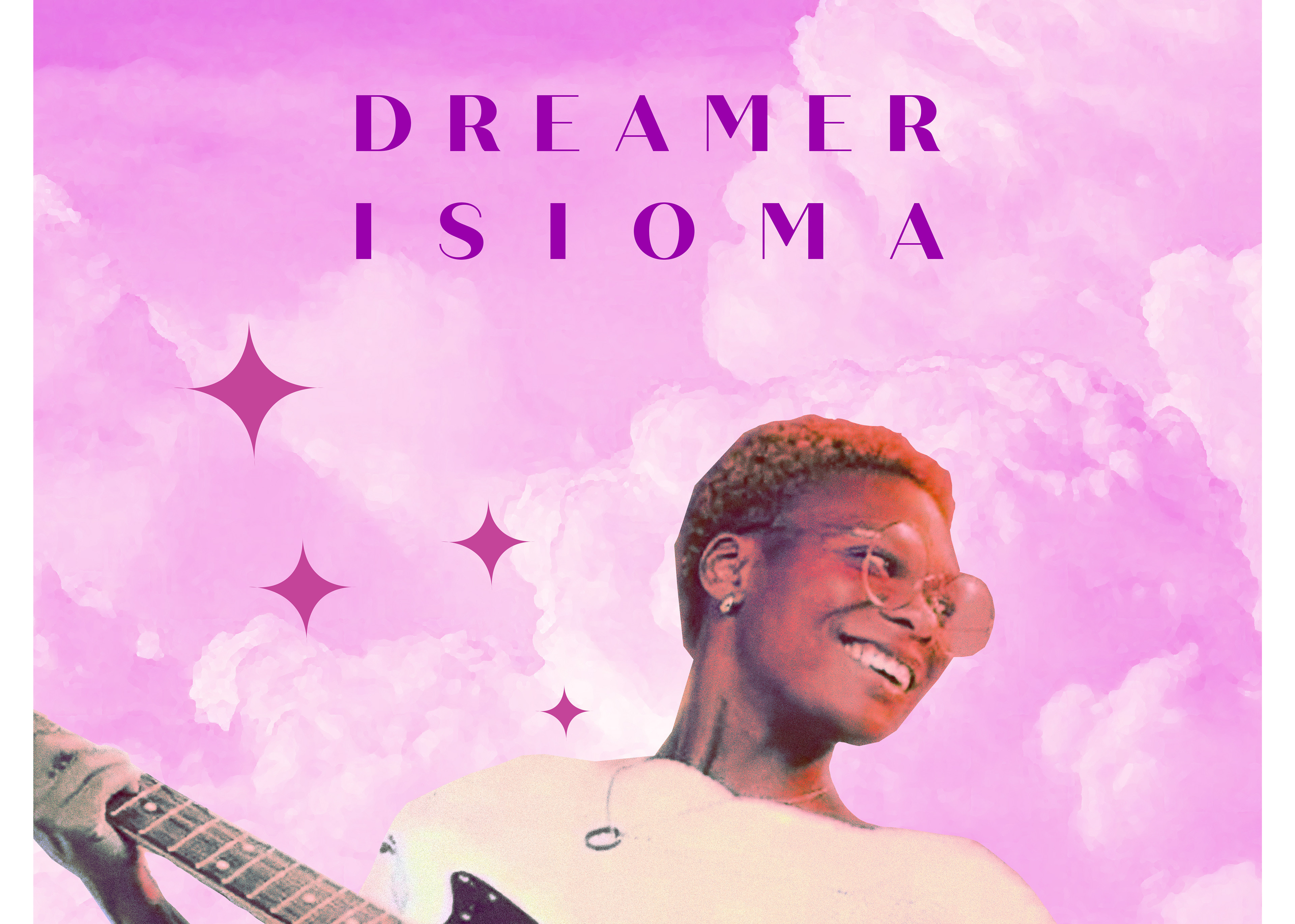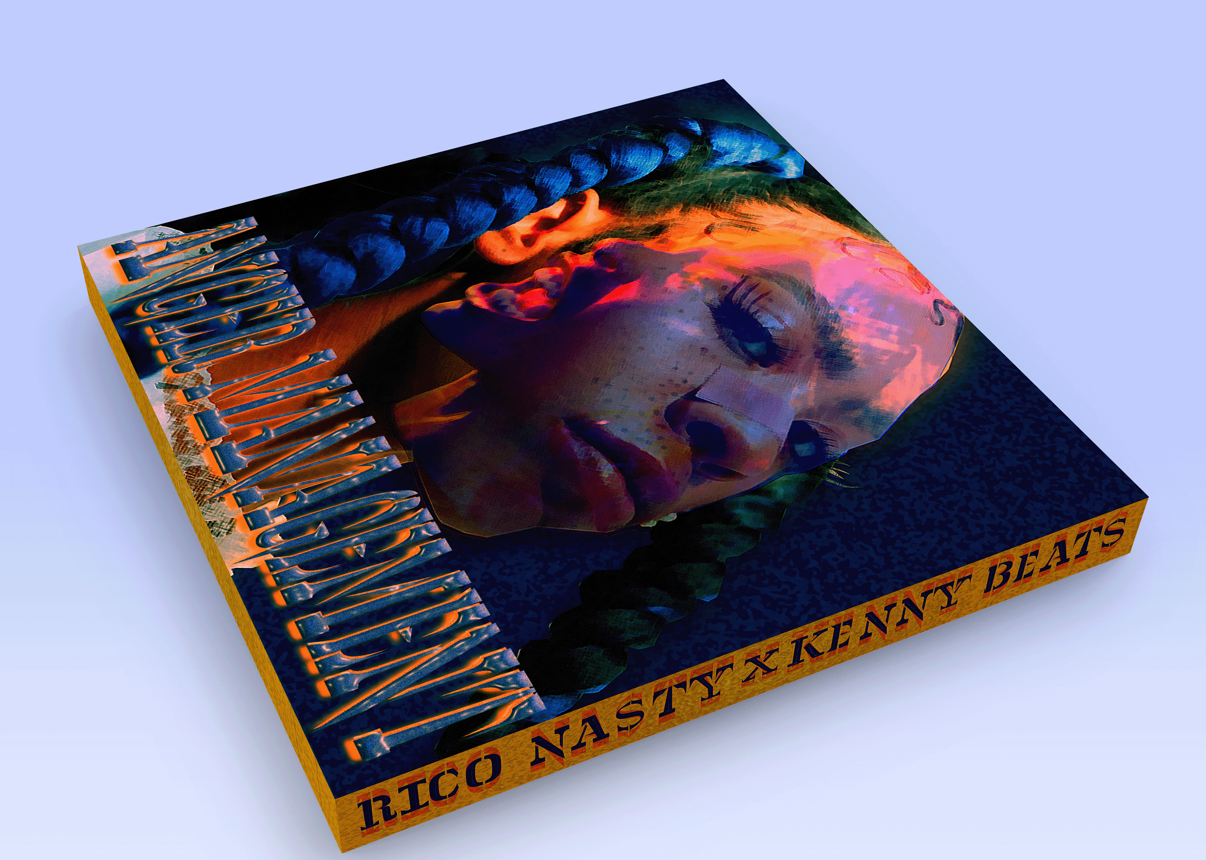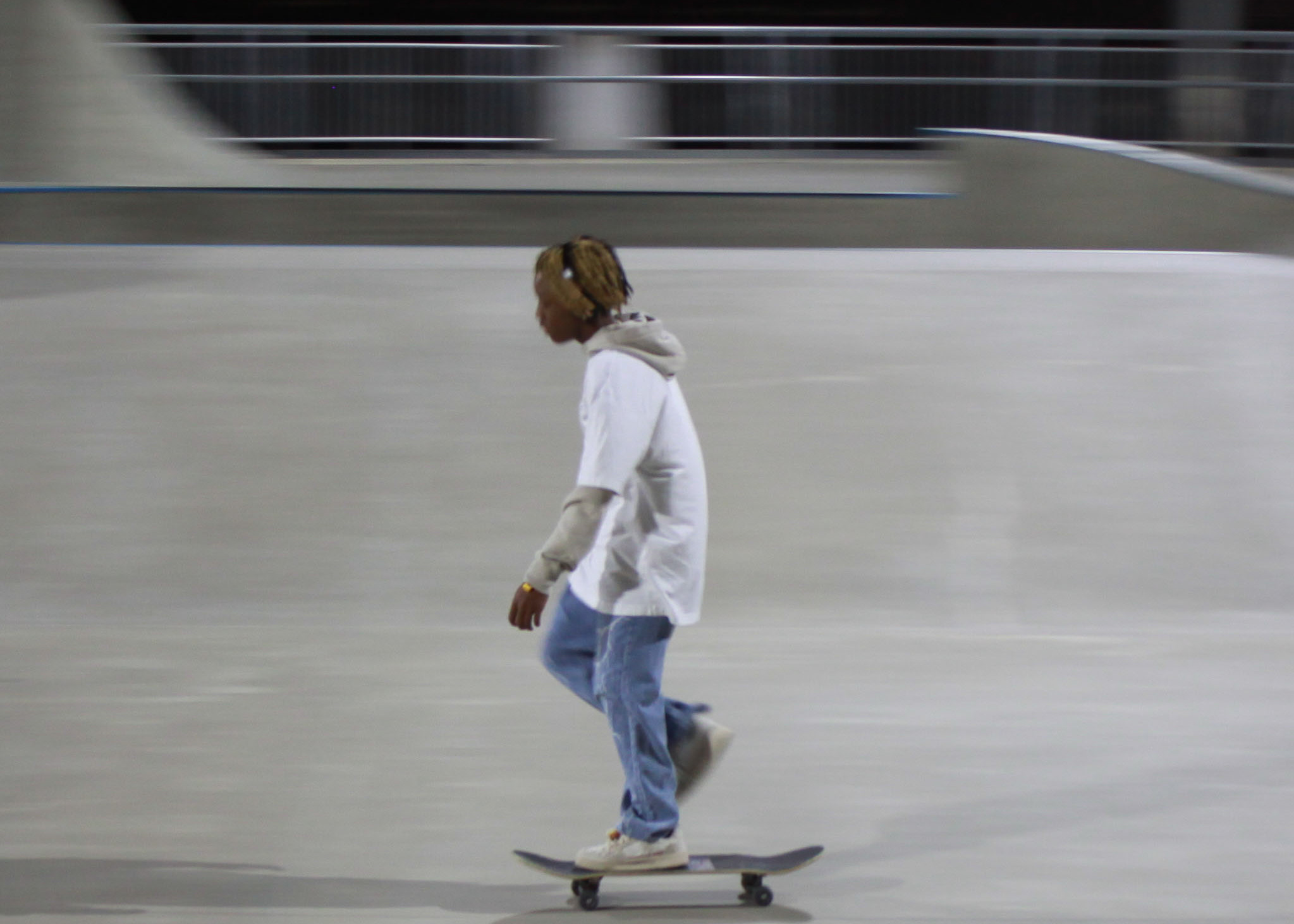

For this poster I used photos from an existing photoshoot for Mio. There were two images from the shoot which captured very contrasting feelings from one another, and that’s what I decided to use. To create visual interest in the background that doesn’t take away from the main figure I used a basic pattern and cohesive colors with the graphics of Mio. I chose Blue, yellow, and orange due to how they work together, as well as their associations with feelings/mood. (feeling blue)